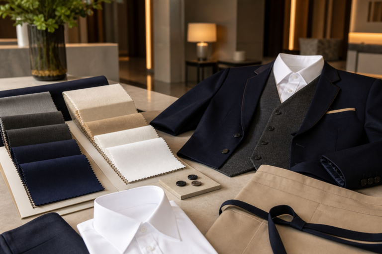
How to Choose Uniform Colors That Stay Professional in Daily Use

Color is one of the first things people notice in a uniform. It communicates brand identity, separates teams by function, and shapes how professional the garment looks in daily use. A good uniform color should be attractive in the showroom and practical in the workplace.
For corporate wear, hotel uniforms, school staff apparel, and factory teams, color selection should combine brand feeling with real working conditions. The best palette is one that looks consistent across departments and remains easy to maintain.
Begin with the Working Environment
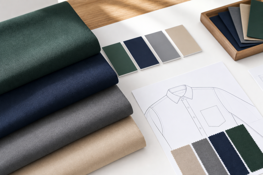
Before selecting colors, consider where the garments will be worn. Darker shades such as navy, charcoal, and deep green are often practical for roles that involve movement, equipment, or frequent contact with surfaces. Lighter shades can look fresh and friendly, but they may need more careful washing and handling.
Lighting also matters. A color that looks balanced under office lighting may appear different outdoors, in a factory, or under hotel lobby lighting. Reviewing swatches in several environments can prevent surprises after production.
Build a Core Palette, Then Add Contrast
Most uniform programs work best with a stable core palette. A main color can be used for shirts, trousers, jackets, or aprons, while contrast colors can appear on collars, cuffs, piping, buttons, or embroidery areas.

This approach keeps the overall look organized while still allowing brand details to stand out. It also makes future repeat orders easier because the key colors are clearly defined.
Test Color Performance Before Bulk Production
Color approval should include more than visual preference. Buyers should review wash behavior, rubbing performance, shade matching between fabric batches, and how the color appears on the final garment shape.
If the uniform will be produced in several fabric types, such as shirting, knitwear, and outerwear, color matching should be checked across all materials. A professional uniform program depends on consistency, not just a beautiful single swatch.